Brand identity — 2026
AR Medical Weight Loss
A new logo for a group of four weight loss clinics across Arkansas, Kentucky and Tennessee. One mark that every clinic shares, with only the letters and the colour changing.
- Role
- Logo, identity system, logo book
- Year
- 2026
- Duration
- Logo book
- Discipline
- Identity
The concept
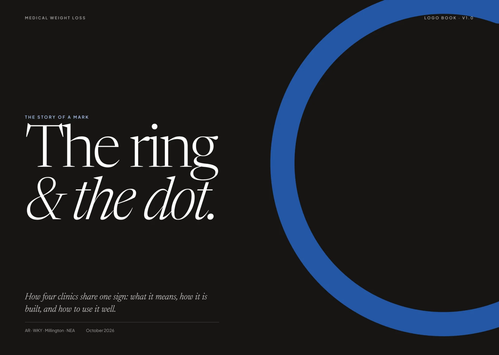
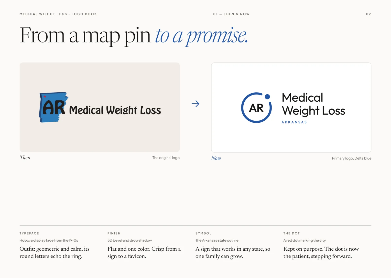
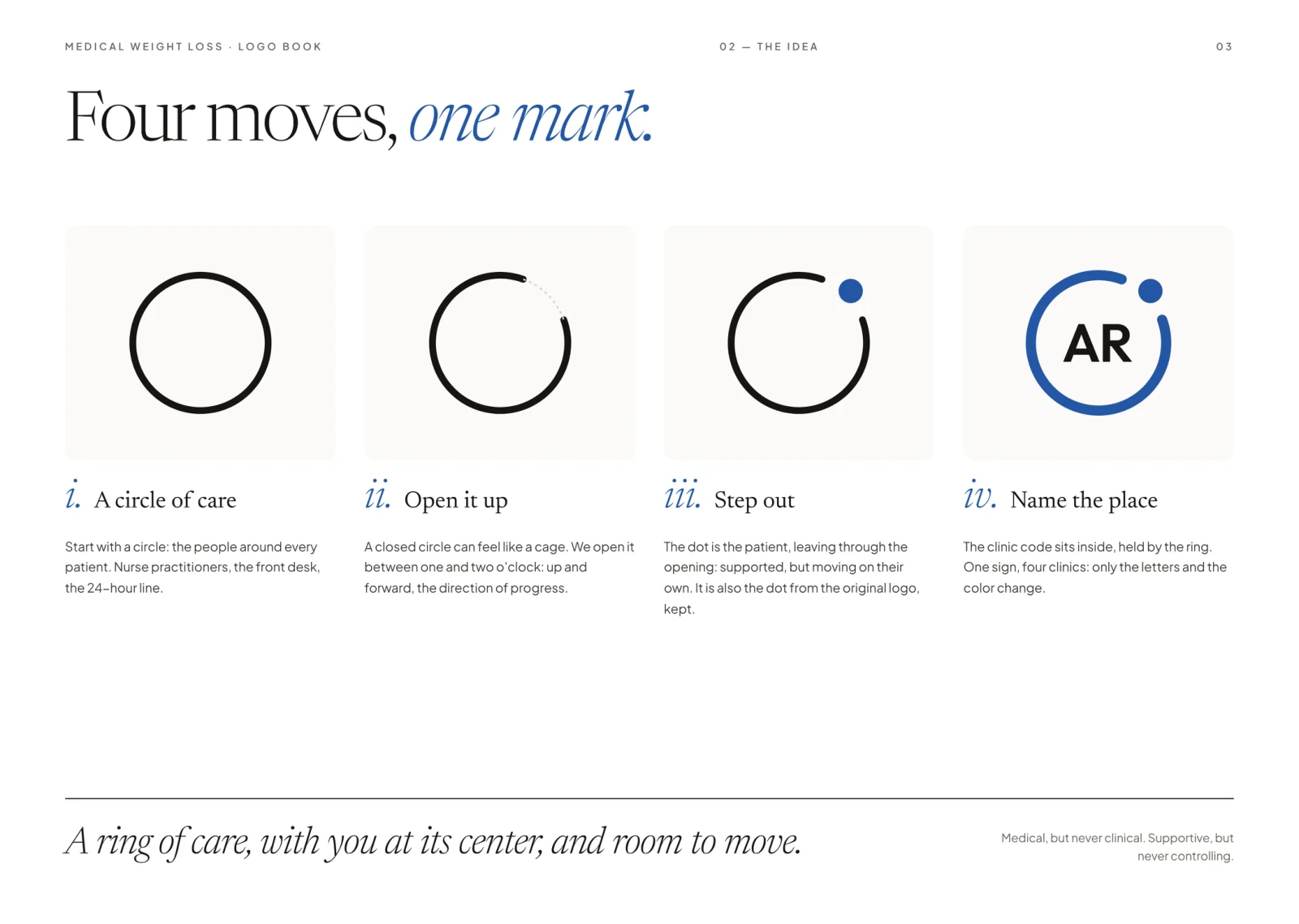
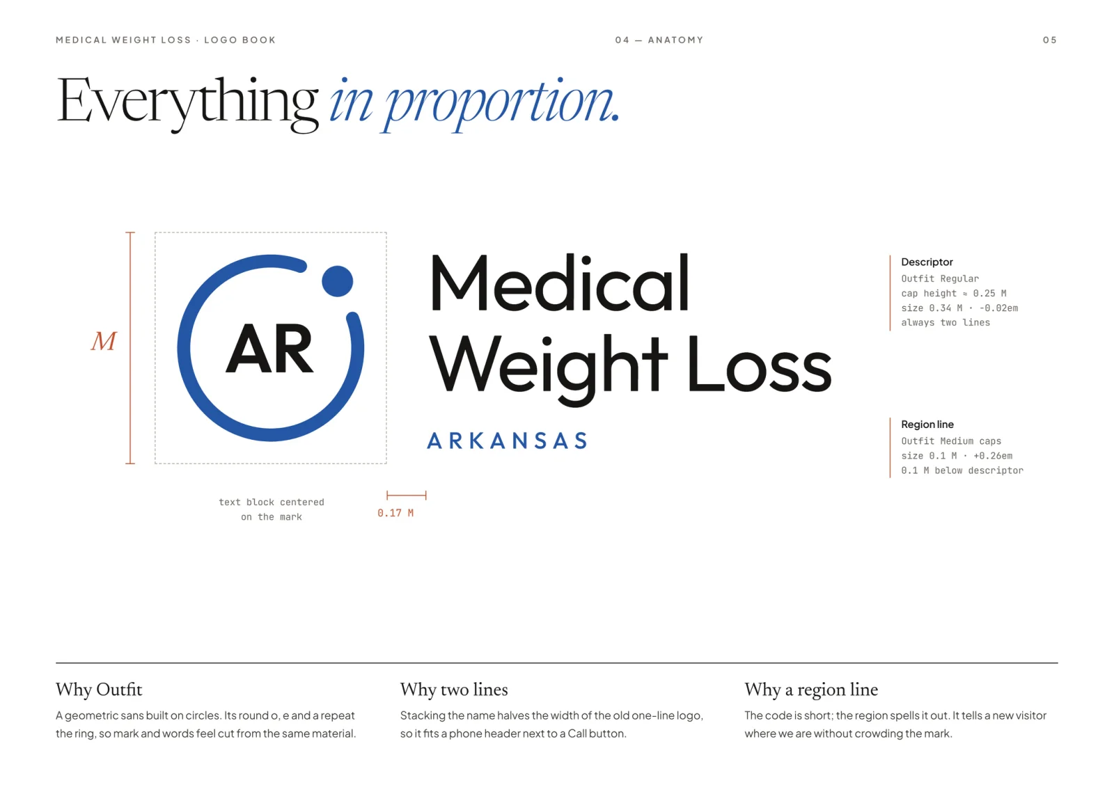
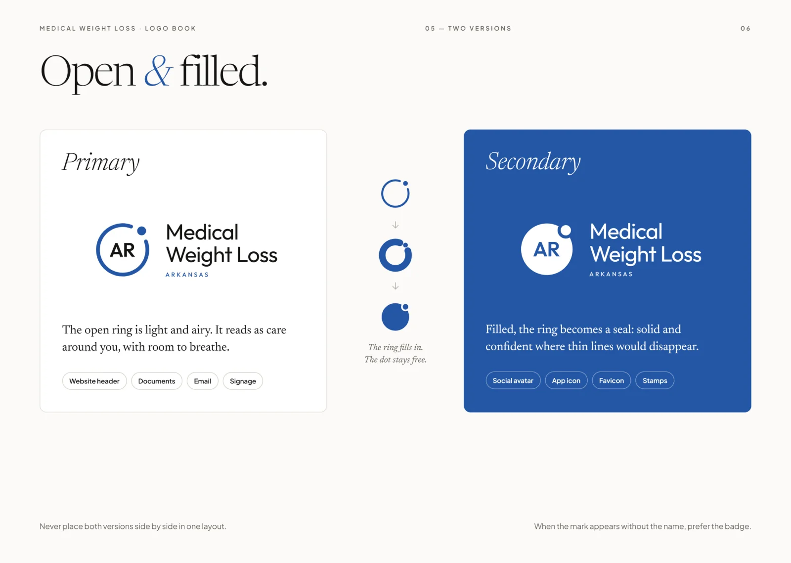
The old logo was a bevelled map pin tied to one state. The new one is a ring of care, opened up and to the right, with the patient as a dot stepping out through the gap: supported, but moving on their own.
How it ran
- 01
Keep what already worked
The red dot that marked the city in the old logo stayed. It became the patient, so existing patients still recognise something in the new sign.
- 02
Build it on a grid
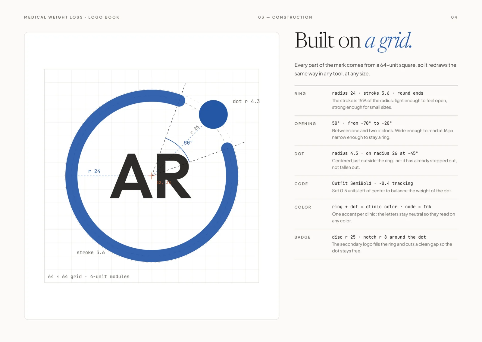
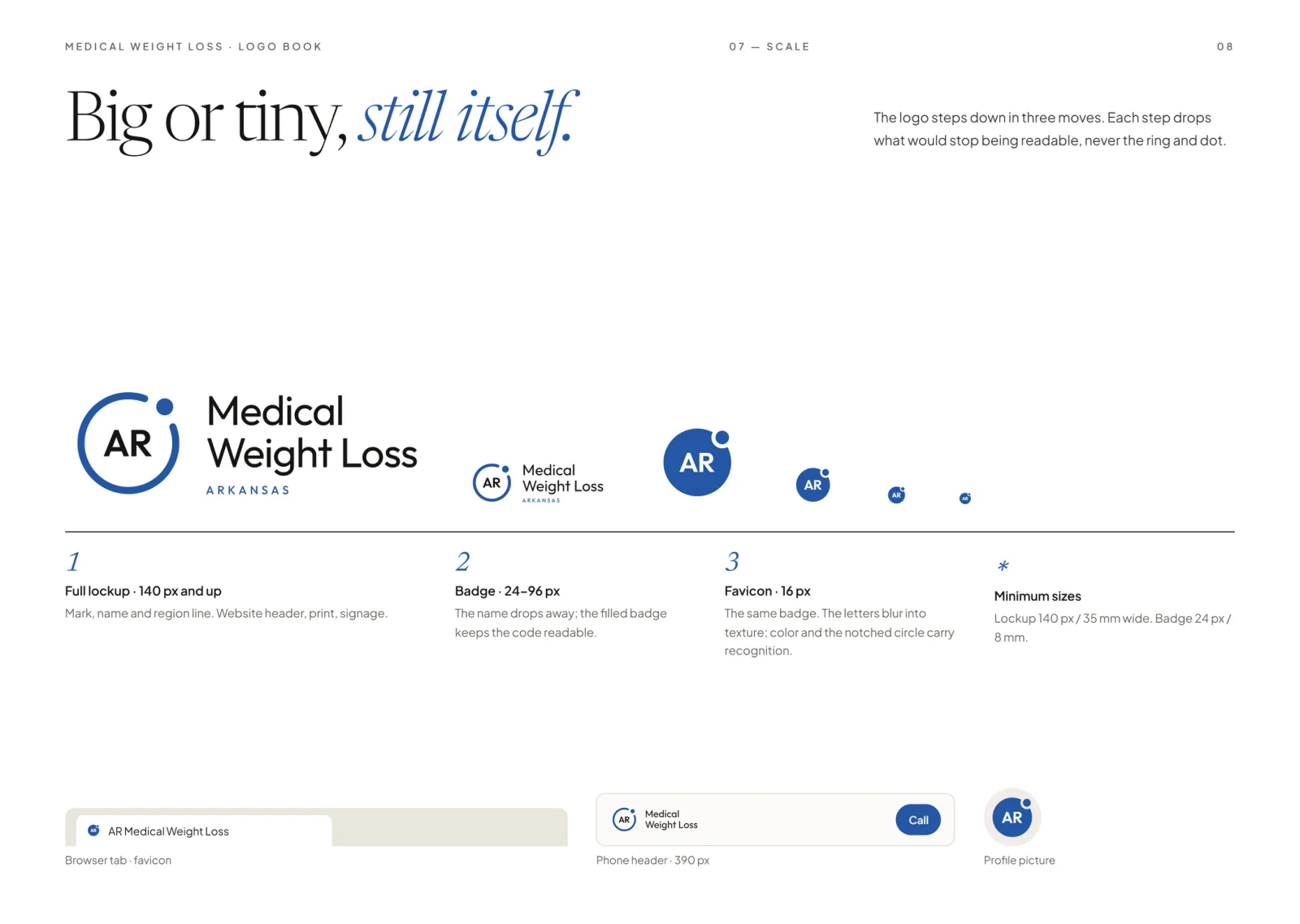
Ring, opening and dot all come from a 64-unit square, so the mark redraws the same way in any tool and still reads at 16 px.
- 03
One sign, four clinics
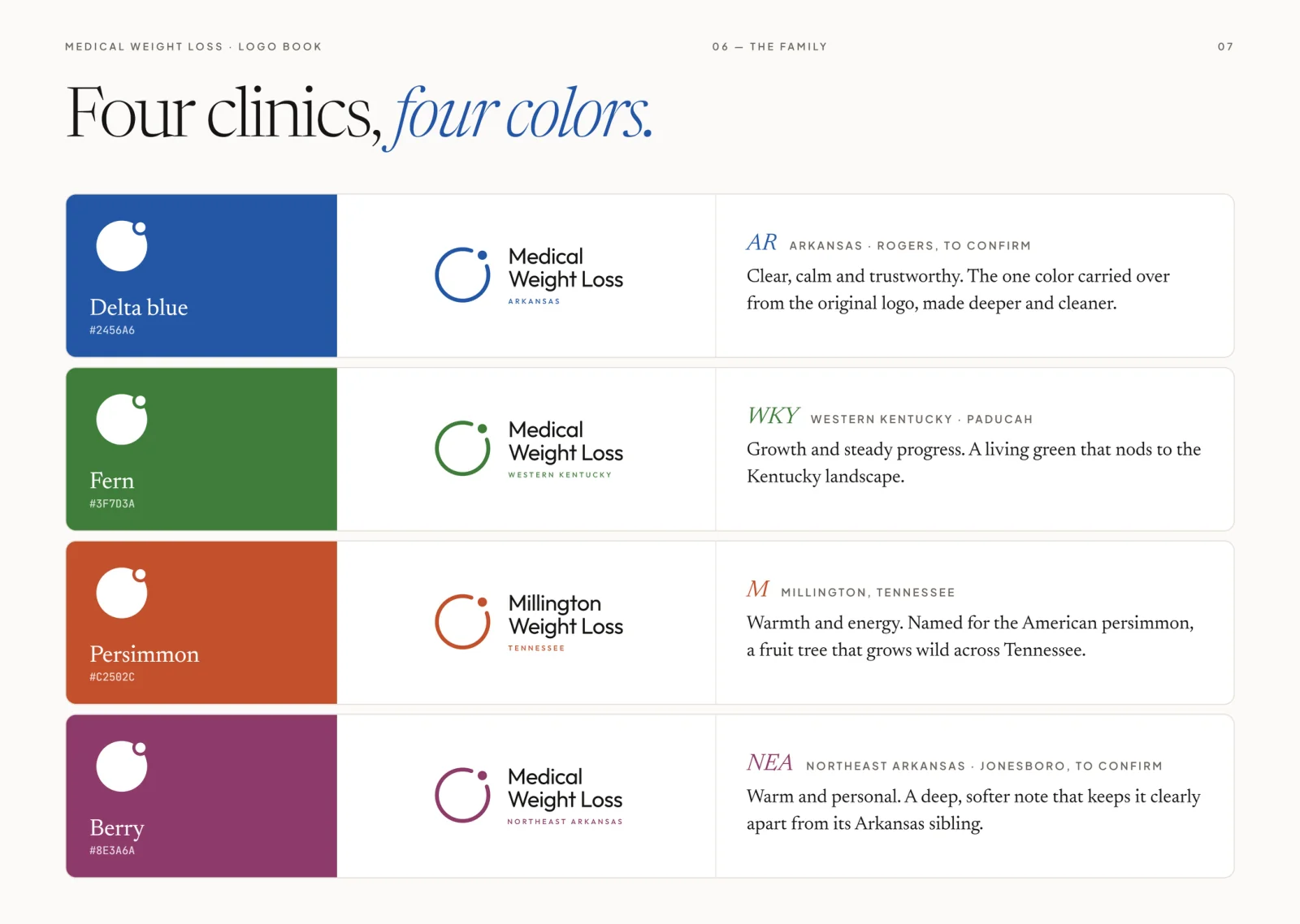
Each clinic gets its own code and one accent colour. The letters stay neutral, so the family reads as one group without the clinics blurring together.
Scope
- Audit of the original logo
- Mark concept and construction
- Four-clinic colour family
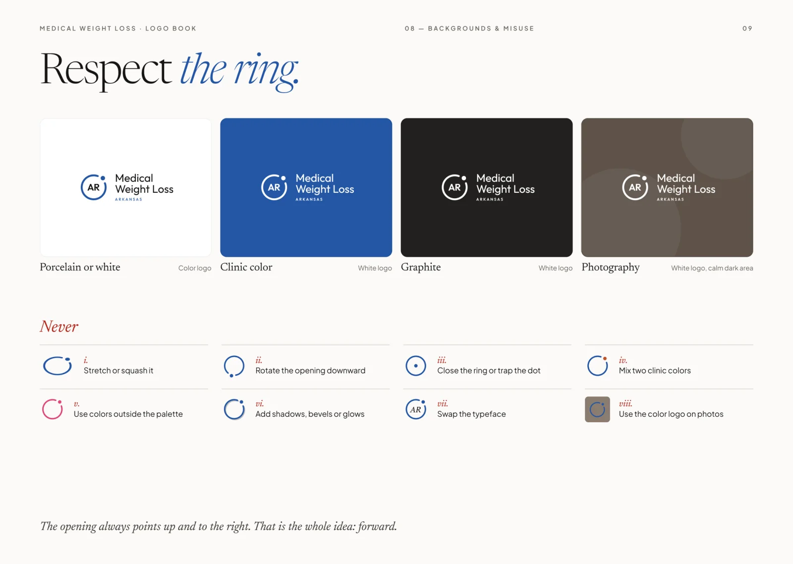
- Scale, background and misuse rules
Delivered
- Primary logo and filled badge
- Four clinic variants
- Construction and usage rules
- 10-page logo book
Outcome
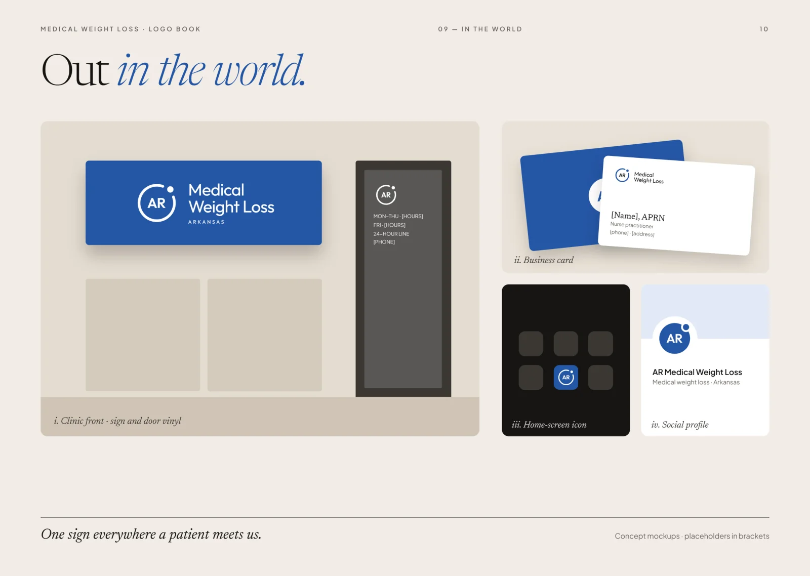
A mark that works from a clinic sign down to a browser tab, and that a fifth clinic can join without a redesign.